Trading Basics: Don’t Forget About The Big Picture
Get Perspective With Multiple Time Frame Analysis
When the market is moving fast and volatility is high, or even just at times when it is moving against you, it pays to get a new perspective. It is all too easy to get caught up in a chart, focusing on what is happening right now, and forget about the cliff that looming ahead. That’s where multiple time analysis comes into play. Multiple time analysis is simply the practice of viewing charts in more than one time frame. A trade like myself who typically watches the daily charts may also view weekly and monthly charts or even lower time frames like hourly or 5 minutes.
The daily charts helps me see what is going on in the market from day to day. This is where most of the big signals are formed but not the only place. I also use the weekly charts to view the greater trend. Is the asset moving higher or lower, does the market like or hate this asset, or is it in a range. If it’s in a range, is price action approaching or retreating from either support or resistance? All good things to know when trading at a lower time frame.
The Multiple Time Frame Strategy
The Multiple Time Frame Strategy views the market like a vast ocean. The ocean has tides, within those tides are waves, and among the waves are ripples. A Multiple Time Frame trader tries to catch the ripples and waves traveling in the same direction as the tide. Using myself as an example and looking to place a trade on Gold in the daily or hourly time frame I might start with monthly charts to be safe.
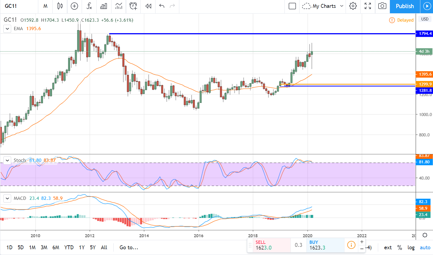
On the monthly gold chart you can see that price action has been within a great trading range for over a decade. The price action is moving higher and has been for some time, if anything the coronavirus added volatility, so the outlook is bullish. The indicators are bullish as well, the only caveat is they are weakening so caution might be needed in lower time frames. Caution, as in wait for good signals in line with the tide. The tide is bullish, there is room to go higher, but resistance may be present on weekly or daily charts. At this point, the goal is a bullish trade with a target near the late-2012 high.
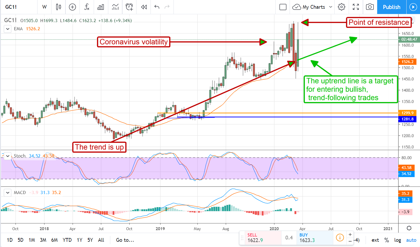
The weekly charts are about the same. The trend has been bullish and was looking great but the coronavirus pandemic induced some wicked volatility. The volatility is much more visible on this chart, the good news for us is that it looks like a bullish signal may be forming. Remember, I said may be forming so it is too early to make a trade. We need to look at the daily charts but it may be days or weeks before the actual signal to buy would trigger. The caveat is that resistance is close above so it may be wiser to wait for the price to break out to a new high.
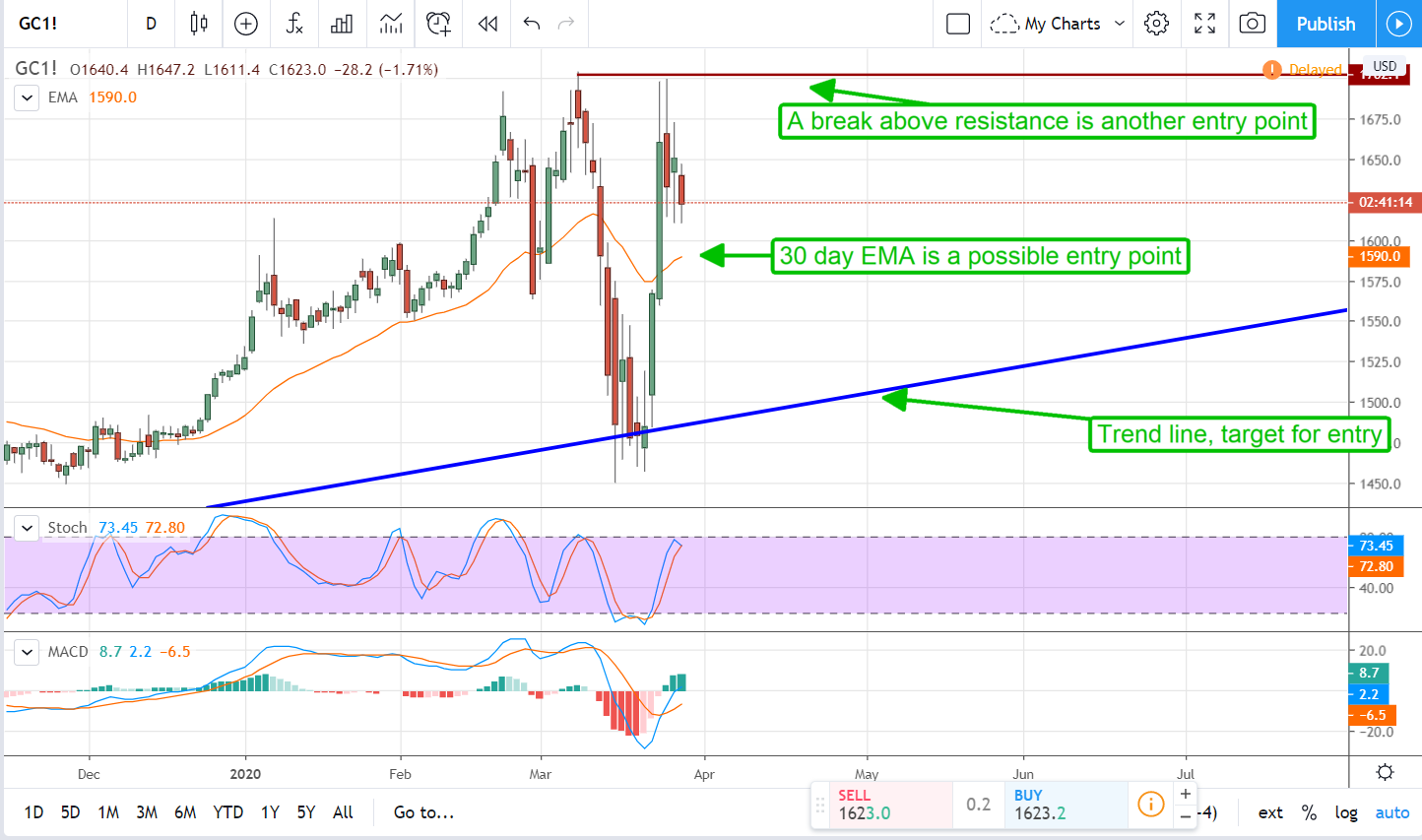
The daily chart shows a generally bullish trend, recent volatility, and a couple of potential entries for bullish trading. The ideal entry would be along the trend line near $1510 but that may not happen. There may be support at the moving average and it may be strong enough to send prices moving higher again. The way to trade this might be to buy a small amount at the EMA and save another purchase for one of two events. The first is that prices will continue to move down to the trend line where a follow-on purchase is made at a lower price. The second is price action bounces from the EMA and moves up to resistance where a third entry target exists. The third entry signal is, of course, the move to new highs.
Shorter term traders can apply this same technique to lower time frames, maybe start with week and go down to day and hour, or use daily, hourly, and five minute data. Regardless, taking the time to move out and see what’s going on in the chart around you can pay off. Just because you see price action movin in one direction or another doesn’t meant the rest of the world does too. Those support and resistance lines you don’t see, the ones on the higher (and sometimes lower) time frame charts are the ones that always kill your trades.