A Powerful Candlestick Price Pattern
Candlestick charts are a type of visual chart which many traders prefer over more traditional bar or OLHC (open, low, high, close) charts. While there is nothing magical about candlesticks themselves–they still represent the price movement of an asset–the way the price information is presented allows you to spot potential reversal and continuation patterns which may be harder to see with other types of charts.
First let’s go over what candlesticks are, and then I’ll discuss my favorite candlestick pattern.
Candlestick Charts
Candlesticks provide the open, high, low and close price data for an asset in a visual way. The difference between the open and close is “fat” and known as the candle or real body. The high and low are thin lines called the tails, shadows or wicks. Therefore, the candle gives you the total range of the day via the high and low, and the different between the open and the close is shown via real body.
Up days–where the close finishes above the open–are generally colored white or green.
Down days–where the close finishes below the open–are generally colored black or red.
This makes it easier to see small details in the price data, which could be missed looking at other forms of charts like the ones provided by less trader-friendly brokers.
Figure 1. Up and Down Candlesticks
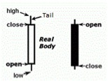
In figure 1 the first candle is “up” because the close is above the open and it is colored white. The second candle is “down” because the close is below the open and is colored black. Tails can be very long or very short and may not even be present at all. Similarly real bodies may be very small if the open and close are at similar levels, or very large.
Engulfing Pattern
This is the pattern I use most often and find most useful out of all candlestick patterns. This is by no means an exhaustive list; there are more than 25 candlestick patterns, but this is my favorite.
This pattern signals a sharp reversal, where aggressive selling shifts to aggressive buying or aggressive selling.
A bearish engulfing pattern occurs after the price has trended higher. “Bearish” is used to define downward movement or when someone believes the price will drop. A large upward real body is followed immediately by a large downward real body, which completely envelops or engulfs the upward candlestick.
Figure 2. NZD/USD Daily Chart – Bearish Engulfing Pattern
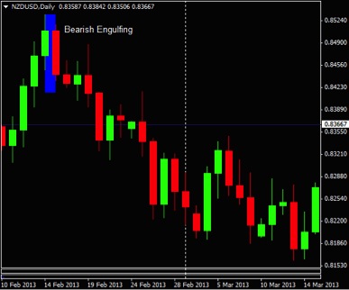
Source: Oanda – MetaTrader
In the blue highlighted portion of figure 2 the red (down bar) completely engulfs the prior green (up) bar, marking a sudden and sharp shift in momentum after a move higher. This is bearish, and indicates more downside movement is likely to develop.
Enter short or buy put options once the down bar is complete. Place a stop-loss, if required, above the recent high.
A bullish engulfing pattern occurs after the price has trended lower. “Bullish” is used to define upward movement or when someone believes the price will rise. A large downward real body is followed immediate by a large upward real body, which completely envelops or engulfs the downward candlestick.
Figure 3. EUR/USD Daily Chart – Bullish Engulfing Pattern
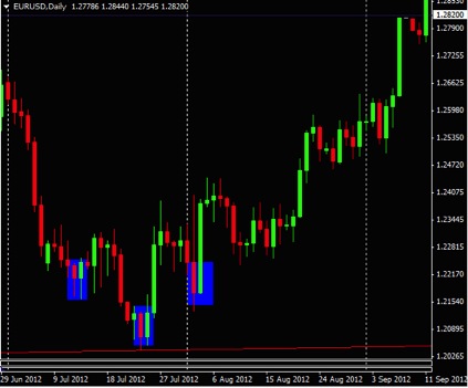 Source: Oanda – MetaTrader
Figure 3 shows three bullish engulfing patterns. The first may have been unprofitable, the latter two were likely profitable as the price rose substantially following the pattern.
Enter long or buy calls once the up bar is complete. Place a stop-loss, if required, below the recent low.
The main problem with both bullish and bearish engulfing patterns is they occur quite frequently. It’s advisable to only trade these after a sustained or sharp move in one direction. Other technical analysis can be combined with engulfing patterns to isolate which patterns you should trade. For example, figure 3 shows a bullish engulfing occurring exactly at a long-term trendline (red line along bottom of chart). These two signals confirming each other were a strong indication the price was likely to head higher.
Final Word
There are many candlestick patterns for you to explore if you enjoy this type of “visual” trading style. Candlestick patterns are useful for both short and long-term trades as these patterns occur on one minute charts right up to weekly charts (or longer). Looking at a chart you’ll see lots of bearish and bullish engulfing patterns. You don’t want to trade all these patterns though. Be selective, and only trade a bearish engulfing pattern after the market has a strong run higher. The bearish engulfing pattern then signals a potential top and an end to the buying. Trade a bullish engulfing pattern after the market has fallen. The bullish pattern signals a shift in a momentum and a potential bottom. Use other technical analysis methods to validate engulfing patterns. For example, a bullish engulfing pattern that occurs at a support level is more likely to work out than if a bullish engulfing pattern occurs on its own.
More On Candlesticks: