Using Momentum Peaks As Entry Points
This is an introduction into one form of MACD wave analysis and how I use it for short term trading. MACD is a well known indicator of market momentum and one that can be used in a wide variety of ways. For now I will focus on one general method that I use on a daily basis. For this method I use longer and nearer term analysis of the MACD to help predict underlying direction and pinpoint high probability entries. I want to be clear so there is no confusion, this not time frame analysis in the sense that I use a longer term chart and a shorter term chart. This is analysis of what the MACD is doing in one time frame but in terms of “now” and “over time”. In that sense the nearer term analysis is what is happening now and in the present whereas the longer term analysis is a view of what is happening over time. If the longer term analysis is bullish, and the nearer term analysis is bearish then it makes sense to think that the longer term momentum will overcome the shorter momentum.
MACD is useful for measuring the trend and its strength but it is also useful for pinpointing entries. Most traders will wait for a crossover of the zero line before entering a trade but I find that to be a little late. By utilizing the perspective of MACD over time in conjunction with what it is doing in the here and now you can capitalize on counter trend movements in a way that could easily double your potential profits from any given market movement. This is not a counter trend strategy, it is a trend, or I should say momentum, following strategy that seeks to target counter trend extremes as entry points. Most signals require asset prices to return to bullishness or bearishness before signaling an entry. Look at the chart below. The MACD signals a trend following buy on a crossover of the zero line. If you look closely though the move began much sooner than the signal. The peak of bearishness, in hindsight, is the best entry point but not one that many traders or gurus will tell you to buy on as it carries more risk.
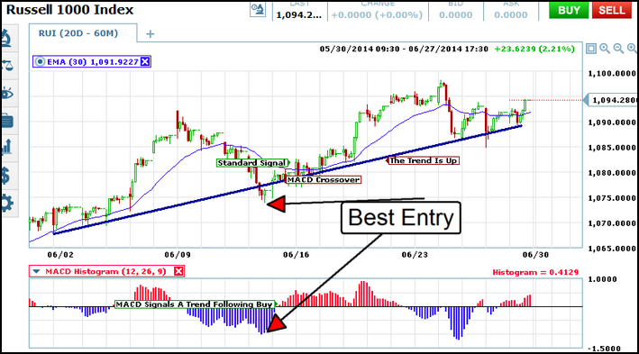
Looking at what I have marked as the best entry it is easy to see why. At that point the index price is at an extreme low. The caveat is that the MACD at that time is also convergent with the near term down trend and in ordinary analysis would be indicating lower, not higher prices. The thing to keep in mind is that the bearish peak is in the nearer term, in the longer term the trend is up. Once trend is determined only take trades in the direction of the trend until reversal is indicated. On this chart it is easy to see, with the addition of my trend line, that the trend is up but there is additional confirmation with the MACD. Over time MACD is convergent with the trend. Look at the chart below, it is the same chart as the one above but with a different analysis. Notice how the MACD peaks are growing as asset prices are climbing. This indicates an uptrend as well as one with strength. The strength of the up trend a signal that it will continue to at least one more peak which means that the next dip into bearish momentum would be an entry point.
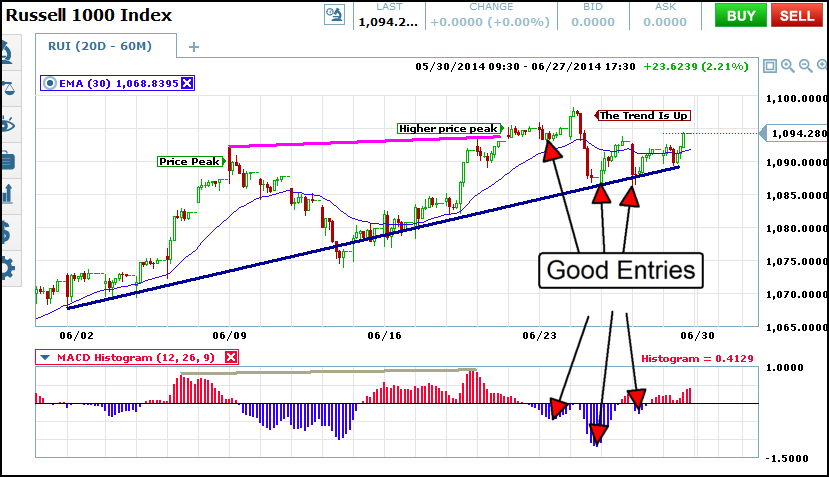
Look again and we can see that the next three dips into bearish momentum did indeed result in positive entry for bullish trades. Each time that MACD dipped into the bearishness, the blue, and then peaked and began to recede a bullish trade could have been entered. Each peak resulted in a 5-7 candle bounce from the trend line and additional confirmation of the underlying trend. At the far right of the chart price action is moving up to another bullish peak. If prices make a new high then this strategy can be used on the next dip as well. If MACD diverges from price it may be time to adjust trade stance.
The trick with this strategy is to utilize strong trends and then to capitalize on counter trend extremes. The trend is what is happening over time while the near term counter trend movements are what is happening now. Additionally, you can employ multiple time frame analysis as well. A strong buy signal on a daily chart could lead to multiple counter trend entries on a shorter time frame chart like the ones I used here.