Traders Dynamic Index (TDI)
Hi everyone,
In this article I am going to explain you and introduce you the “Traders Dynamic Index” indicator. TDI is about the trends, market volatility and market strength. It’s very popular and there are many traders who base their entire strategy only to the TDI signals. Let’s see how this indicator looks like.
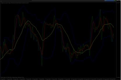
In this chart we have the TDI. You can see two blue lines (upper and lower) which look like the Bollinger Bands, one green line, one red one and last a yellow one. What are these lines?
-The blue lines are the volatility bands.
-The green line is RSI’s Price line.
– The Red line is the Trade Signal line
– The yellow line is the Market base line.
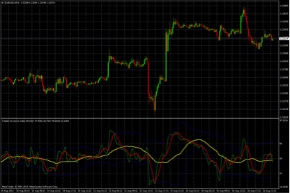
Also, you can add levels to this indicator. Many traders add level 50 to filter TDI’s signals. I will explain it below. Now, add level 50 and your chart should looks like this.
Now, I will explain you when we have short and long signals.
We have a long signal when the green line crosses the red line. On the other hand, we have a short signal when the red line crosses the green one.If you want to filter your signals look for shorts below the yellow line and for longs above the yellow line. If you want to have stronger signals you should look for a cross (green crosses the red and is now above the red line) above level 50 for a long signal and you should look for a cross (red crosses the green line and is now above the green) below level 50 for a short signal.
Let’s see some examples.
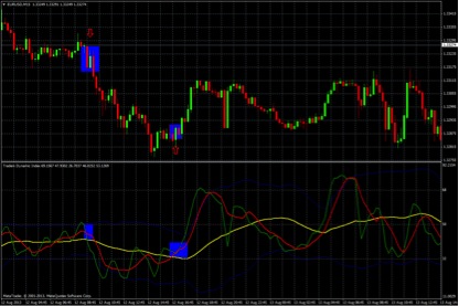
This chart is from EURUSD currency pair and I use a 15 min timeframe as you can see. I drew two rectangles and two arrows in this chart. In the first rectangle we have a short signal, we have a crossover and the red line is now above the green one and in the second rectangle we have a long signal, we have a crossover and the green line is now above the red one.
It’s a really simple and easy to understand indicator. Use it to the higher timeframes to avoid the noise and take longer expiry time.
Best,
Kostasze