The Two Time-Frame Approach to Trade Selection
In former articles I have talked a lot about utilizing multiple time frames to make trading decisions, as well as discussing strategies for making trades. These can seem like independent topics though, and sometimes traders aren’t sure how to combine looking at multiple time frames, and then deciding when to pull the trigger on a trade. Looking at a recent trade example, I’ll show you how I use a longer-term chart to find potential traders, and then use a shorter-term chart for my trade set-up and entry.
The Longer-Time Frame
I typically have about 10 to 15 charts open showing different forex pairs. Each night I reset all my charts to a daily time frame. I quickly glance through each one and look to see which are trending strongly overall, or recently had a very sharp move over the last week. At this stage I am just looking to narrow this group of pairs down to about 5 pairs or less. I am only looking for pairs where it looks highly probable they will continue in their current direction. I also look for high probability reversal points, but usually this is still in alignment with a long-term trend.
Take the USD/CAD for example. Figure 1 shows the daily chart, where the pair had been trending higher. A triangle forms, and the price breaks higher but then quickly fails and strong selling ensues. The strong selling followed by a pause created a pennant formation, which is a continuation pattern (see Rip, Trip, Rip Trade Setup). Given all the evidence, there was a high likelihood the price would continue lower, at least in the short-term.
Figure 1. USDCAD Daily Chart
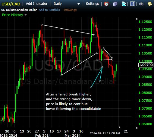
Now in hindsight we can see the price did in fact head lower. But as soon as that small consolidation formed, it was time to drop to an hourly chart and look for an entry.
Figure 2 shows the hourly chart, zoomed in on the small consolidation. Remember, based on the daily chart our expectation is that the price will continue to move lower, therefore we are looking for an opportunity to capitalize on that by looking at the hourly chart.
Figure 2. USDCAD Hourly Chart
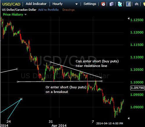
The chart shows two potential entry points on the hourly chart. Once we are able to draw a support and resistance line we can see the price is moving within another triangle. Therefore, we can take a trade near the top of the triangle since we are expecting the price to move lower anyway. This is a more advanced trade because we don’t know how long the triangle may last, which means potentially holding the position through several back and forth price waves.
Another alternative is to wait for a breakout of the triangle. Enter short (buy puts) as soon as the price breaks the triangle to the downside, as this confirms the expectation of a further price decline.
Two Time-Frame Considerations
In this example the daily chart and the hourly chart showed very similar things. The consolidation was visible on both the daily and the hourly chart. That won’t always be the case though. Sometimes you may have very strong daily price bars, indicating the trend is likely to continue in that direction. Dropping down to an hourly or 30-minute chart though you may notice a pattern like the one in Figure 2.
The approach is still same. The daily chart provides the direction for the trade, and the shorter timeframe is used to find entry points. If you can’t find a good entry point, don’t take the trade. If you can’t tell what the next likely direction is on the daily chart, don’t trade that pair.
This approach filters out many low-probability traders, but also provides a ton of high quality opportunities.
The time frames used will vary by trader. The example in the figures above was for a swing trade; therefore, I’d expect to be in the trade for a couple days. If day trading an hourly chart may be your longer time frame, and the 5-minute chart your shorter timeframe. The approach is still the same. Look to the hourly chart for a direction to trade in, then the 5-minute chart finds an entry point.