RSI Fluctuations to Confirm Trends
The RSI, or Relative Strength Index, is a popular technical indicator, and has many different uses. By looking at the range the RSI is fluctuating in, it is often possible to tell whether a price trend is likely to continue, or if it is reversing.
RSI Intro
The RSI falls into a family of indicators called “oscillators.” The indicator moves back and forth between 100 and 0 (rarely reaching those extremes) as the price moves up and down.
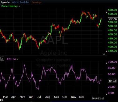
As figure 1 shows, the RSI is highly correlated to the price, rising and falling as price does. The RSI will fluctuate to varying degrees though, since it is always comparing the magnitude of recent price gains to recent price losses and then converting it into a number between 100 and 0.
Figure 1. Apple (AAPL) stock with RSI Indicator
RSI Ranges
The levels that the RSI fluctuates between, let’s call it the RSI range, can help determine and confirm the trend.
During an uptrend the RSI will almost always have peaks above 80–often 90 in a strong trend–and will create lows above 30. Levels may vary slightly between individual stocks, or across markets, but these are a good general guideline.
As figure 2 shows, during the uptrend, the RSI continually reaches peaks of 80 or higher, and holds the 30 area on lows (pullbacks in price).
Figure 2. S&P 500 SPDR (SPY) with RSI Uptrend Range
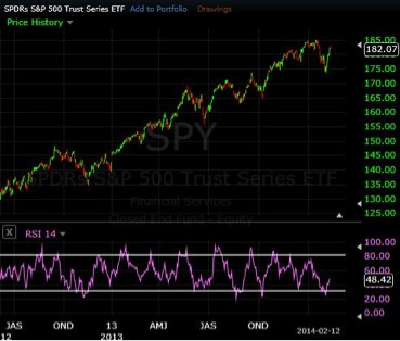
Seeing the RSI continually reach the 80 region provides confirming evidence that the uptrend is still strong.
The RSI holding above 30 also provides confirming evidence. The indicator is not perfect though. We can see on a number of occasions the price dipped slightly below the 30 level even though the overall trend remained up.
During a downtrend the RSI will generally touch 20 or below–reaching to 10 on strong downtrend moves–and create highs below 70 (60 in some markets).
Figure 3. Apple (AAPL) stock With RSI Downtrend Range
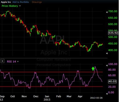
Throughout the downtrend Apple isn’t able to claw much above 70, and continually reaches lows of 20 or lower. These factors help confirm the downtrend.
At the far right of the chart, there is a green arrow on the RSI. It marks a point where the RSI extends well above the downtrend RSI range, reaching 91. This generally doesn’t happen during a downtrend, so it is a warning sign that the trend may be reversing, or the price is entering a sideways phase.
That green arrow, and the associated move higher, occurred just after the start of May 2013. If you look back to figure 1, that point was the beginning of the uptrend shown on that chart.
“Wilder’s RSI” uses a slightly different calculation, and seems to work a bit better at confirming trends using the above method. Since not all charting platforms have Wilder’s RSI, the standard RSI has been used for the above examples. When possible, use Wilder’s RSI.
Bring it Together
RSI ranges are a tool, but are not infallible. While the uptrend and downtrend ranges can confirm trends and warn of reversals, it is always advised that price analysis is done as well. For example, in an uptrend if the RSI dips a little below 30 but the price is still making higher-highs and higher-lows, then trust the price action. Ultimately price is what makes us money, and indicators just help us interpret price moves.
Levels may vary by individual stock, forex pair or other instrument, therefore, establish the appropriate ranges for the instrument you are trading using historical data. This will provide you a baseline to work from. If you like this method, come up with some personal guidelines on how to use it and incorporate it into your trading plan.